Romario Lynch · Selected Work

GRAPHIC
DESIGN.

A selection of campaign graphics, music artwork, promotional design, public-interest communication and real estate marketing.

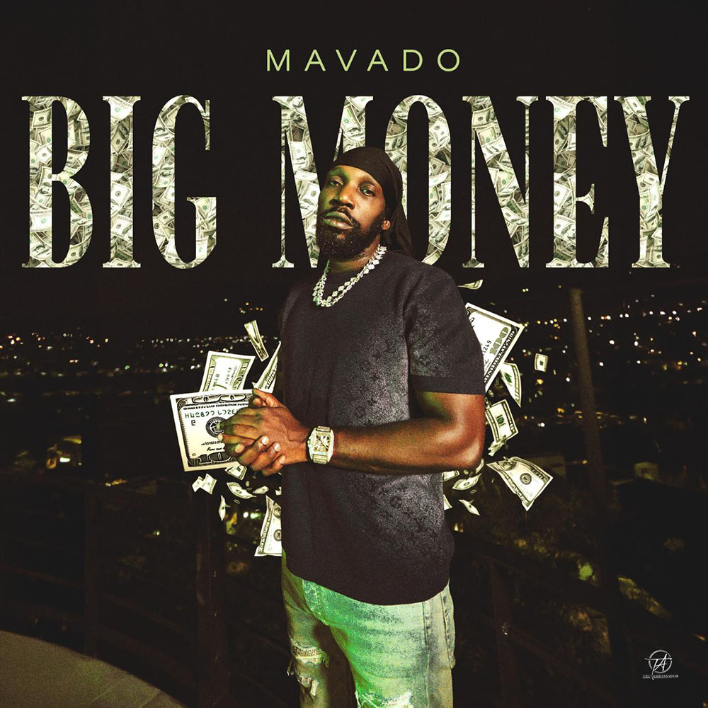
Mavado Big Money cover artwork
Music ArtworkCover Design

Mavado — Big Money

Design choices
  • Oversized serif title doubles as both typography and a money-texture graphic.
  • Artist overlaps the lettering to create depth and a stronger focal hierarchy.
  • Muted green tones tie the portrait, currency imagery and night setting together.
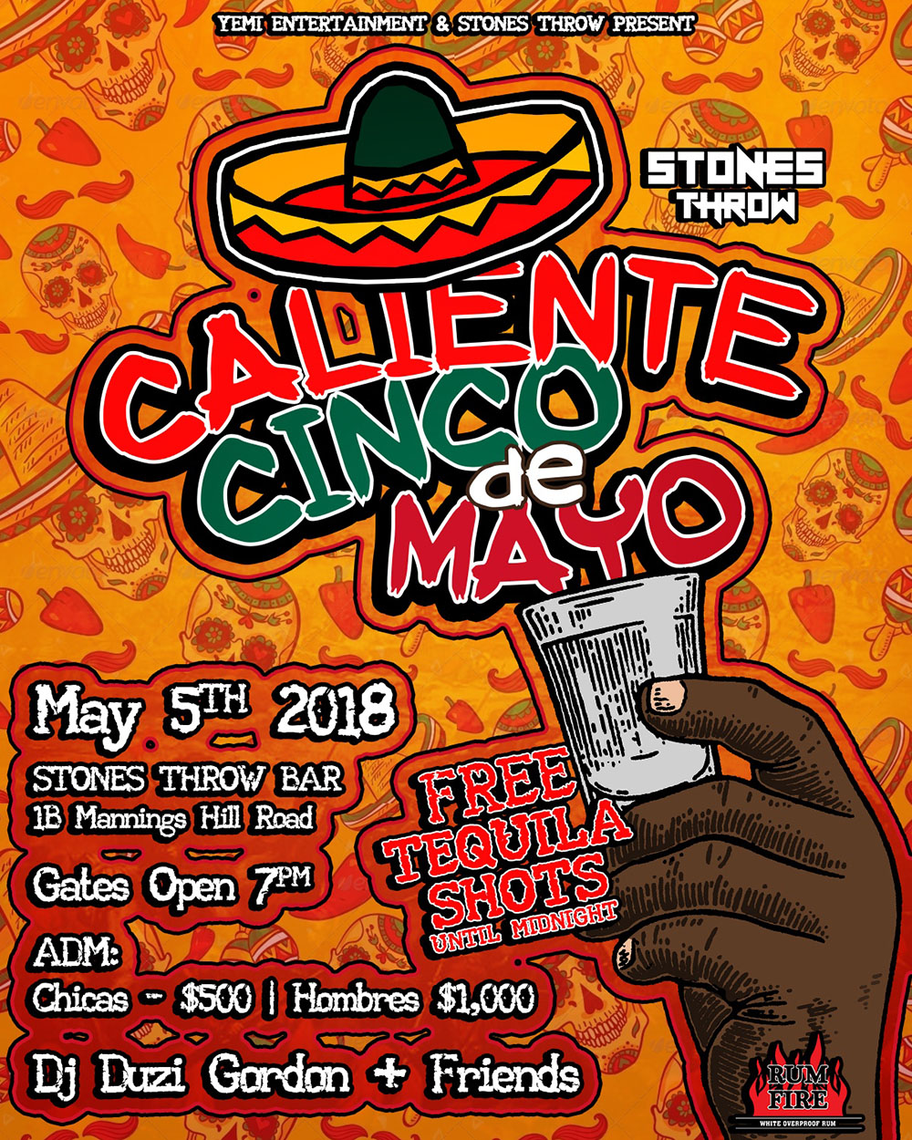
Caliente Cinco de Mayo event flyer
Event Design2018

Caliente — Cinco de Mayo

Design choices
  • Hand-illustrated festival aesthetic built around bold outlines and expressive lettering.
  • Orange base with red, green, black and white creates a high-energy themed palette.
  • Dense event information is separated into clear visual blocks for quick scanning.
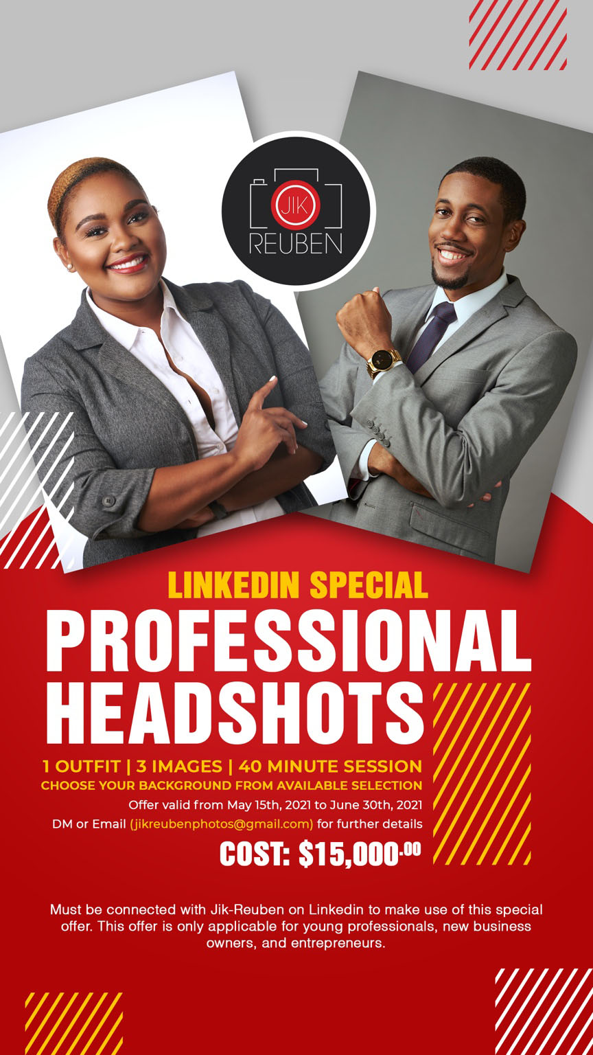
Jik Reuben LinkedIn professional headshots promotion
Campaign GraphicPhotography Promotion2021

Jik-Reuben — LinkedIn Headshots

Design choices
  • Professional portraiture and neutral tones establish credibility immediately.
  • Strong red information field separates the offer from the imagery and improves hierarchy.
  • Yellow accents isolate the promotional hook while angular panels keep the layout energetic.
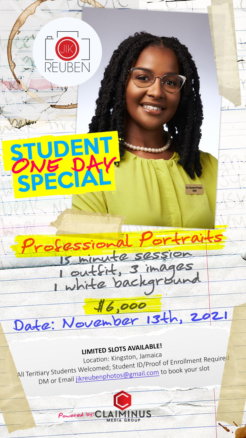
Jik Reuben student professional portraits promotion
Campaign GraphicStudent Promotion2021

Jik-Reuben — Student One Day Special

Design choices
  • Notebook paper, tape and handwritten type create a deliberately student-oriented visual language.
  • Bright yellow, cyan, red and blue add urgency and separate the offer from corporate-style promotions.
  • Portrait remains visually dominant so the photography quality stays central to the message.
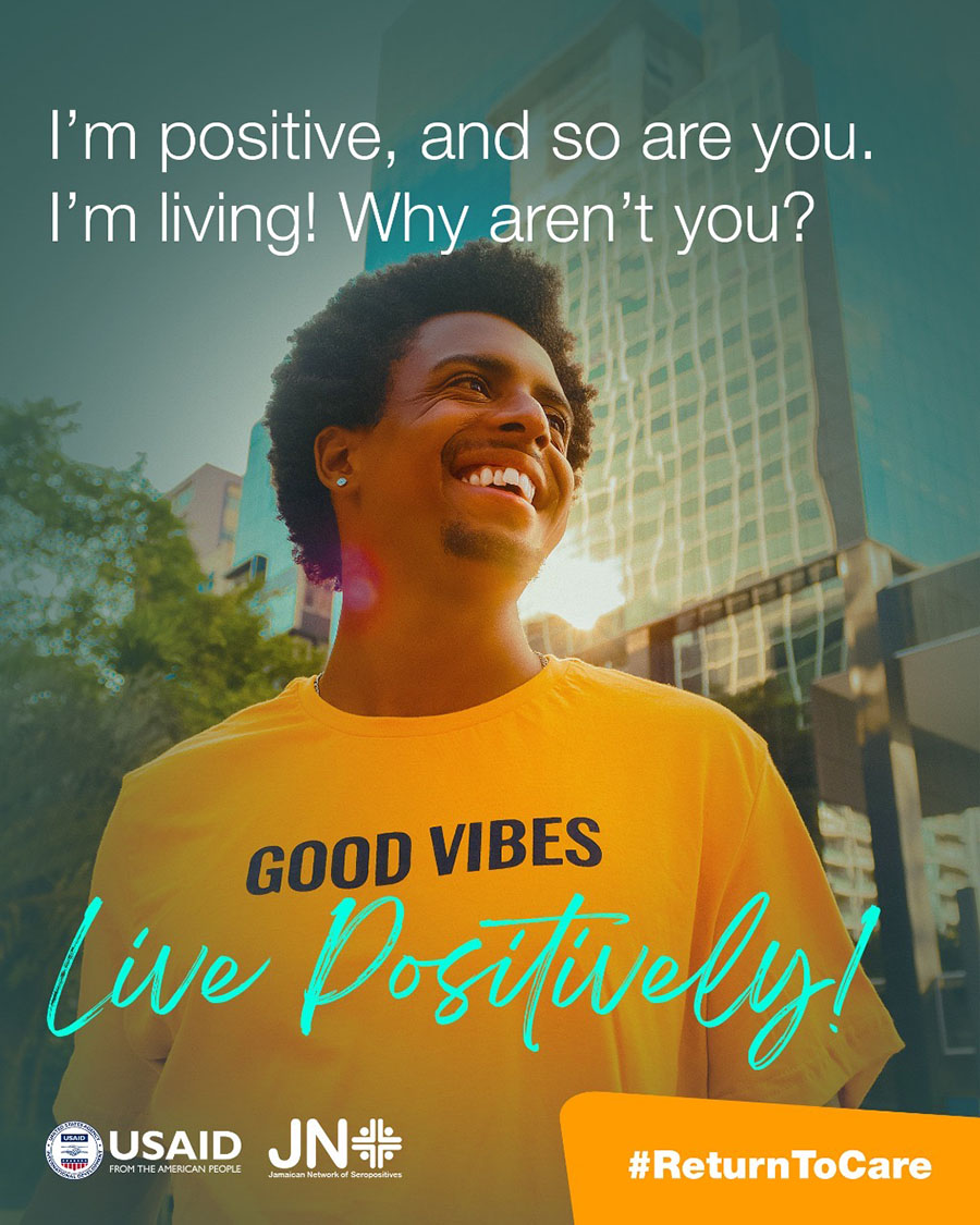
Return to Care public awareness campaign graphic
Public AwarenessSocial Campaign

JN+ — Return to Care

Design choices
  • Warm portrait photography supports an optimistic and human-centered tone.
  • Large conversational headline is placed directly in the open sky area for immediate readability.
  • Turquoise script and orange CTA block create strong visual anchors against the yellow shirt and teal background.
JADS HIV discrimination awareness graphic
Public AwarenessInformation Design

JN+ / JADS — HIV Discrimination Awareness

Design choices
  • Darkened photographic treatment creates enough contrast for the large white message to remain dominant.
  • Question-led headline makes the communication direct and immediately relevant to the intended audience.
  • Contact information and partner logos are separated into clear zones so the call to action stays easy to find.
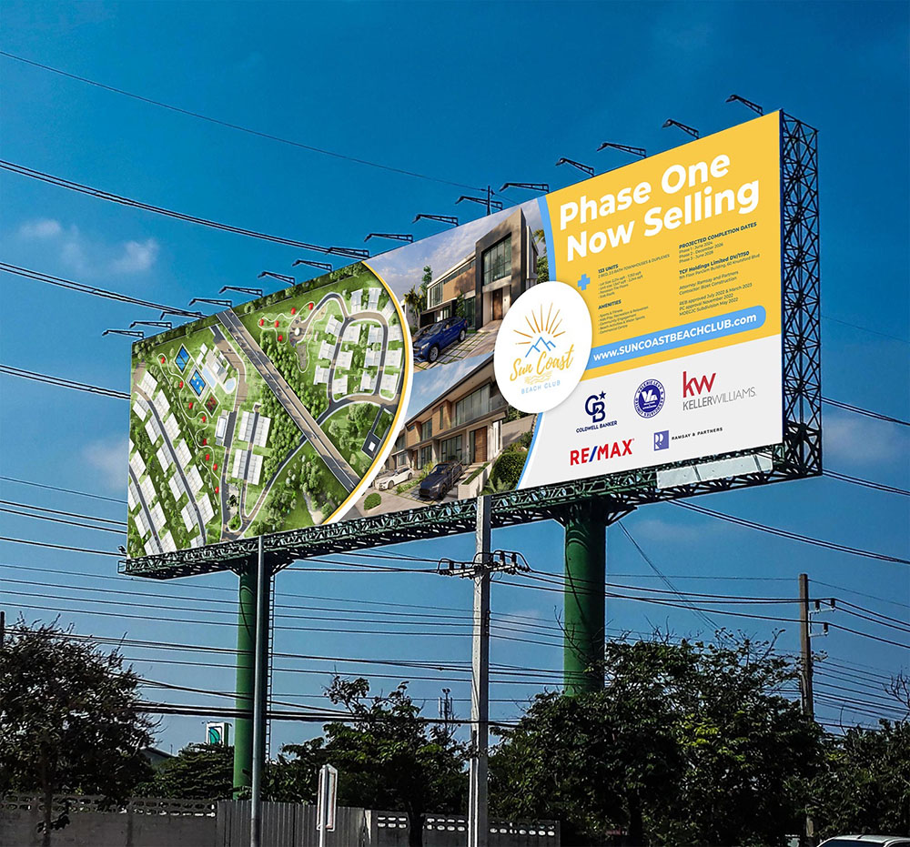
Sun Coast Beach Club real estate billboard design
Real Estate MarketingBillboard Design

Sun Coast Beach Club — Billboard

Design choices
  • Large yellow sales panel gives the primary message strong roadside visibility.
  • Site plan and architectural visuals communicate both development scale and finished lifestyle.
  • Curved image divisions guide the eye across the billboard while keeping multiple visuals cohesive.
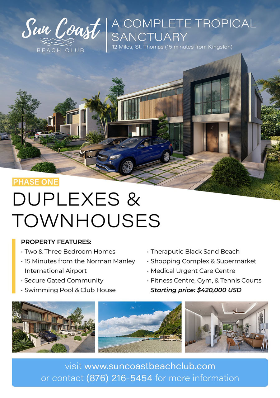
Sun Coast Beach Club property marketing flyer
Real Estate MarketingPrint / Digital Flyer

Sun Coast Beach Club — Property Flyer

Design choices
  • Hero architectural rendering establishes the product before introducing detailed sales information.
  • Large typographic hierarchy separates development phase, unit type and key property features.
  • Supporting imagery and blue CTA strip create a clear progression from aspiration to details to contact action.